Tldr,
You are about to discover why pixel art refuses to fade into obscurity despite the industry’s obsession with photorealism. This piece walks you through the historical constraints that birthed a visual language, the technical methodology behind clean clusters and anti-aliasing, and the psychological reason your brain finds jagged edges so charming.
You will learn how modern artists weaponise limitations to create retro video game assets, how to select the proper canvas size for a sprite sheet, and how the community drives the medium forward through indie game development. By the end, you will understand that pixel art is not a technical shortcut but a rigorous discipline of abstraction and precise colour indexing.
Introduction
There is a specific moment of exhaustion every digital artist hits when facing a blank 4K canvas with a brush set to 300 DPI. The infinite scalability of vector paths and the soft blends of digital paint can somehow feel deeply intimidating, almost paralyzing. Pixel art operates as the exact inverse of this problem. It drags you down to a grid where a single misplaced square of colour matters because you have nowhere to hide.
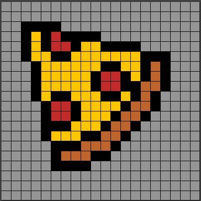
This is not a medium of nostalgic regression where people simply refuse to let go of the 1980s. It is an active, breathing craft where artists use severe restrictions to communicate volumes with minimal noise. The emotional hook lies in the control it offers. When you zoom into a resolution of 32 by 32 blocks, you stop being a passive observer of algorithmic smoothness and start constructing reality manually, one tile at a time.
This article addresses the deep intent behind learning the medium, moving past the surface-level “retro trending” conversation to dissect the practical mechanics, the semantic history, and the editorial theory that makes a low-resolution sprite read as a recognizable face rather than a messy blob.
The Historical Matrix That Forged the Aesthetic
The visual language of pixel art was not a stylistic choice made by designers sitting around a boardroom table. It was a hardwired technical negotiation between processing power and memory constraints. Understanding this industrial backstory is vital for anyone trying to mimic the authenticity of the NES or the Commodore 64 era because faking the look without the logic always looks hollow.
Memory Constraints and the Birth of the Tile Grid
Early arcade cabinets and home consoles operated on kilobytes of video RAM, a figure so small it seems like a typo in the modern context of gigabyte-heavy textures. Engineers had to devise a system where the screen was not drawn pixel by pixel freely but assembled from a grid of reusable tiles. This tile-based background system meant that an artist could only draw a limited set of 8-by-8-pixel or 16-by-16-pixel blocks.
The hardware would then map these tiles to the screen like a mosaic puzzle, drastically reducing the memory load. The practical upshot of this limitation was the geometry of the world itself. Hard lines, strict grid alignments, and background elements that snapped perfectly into place were not rough draft errors; they were the direct visual fingerprint of the Picture Processing Unit’s reading pattern.
When contemporary artists create tilesets for games like Celeste or Stardew Valley, they impose this identical limitation on themselves not just to look vintage, but to achieve a specific mechanical legibility where the player intuitively understands the distance of a jump or the hitbox of a wall.
Colour Palettes and the Engineering of Illusion
If the grid dictated form, the indexed colour palette dictated mood and material. We cannot talk about the history of the craft without delving into the mathematics of the master palette. Early systems used a fixed selection of colours, often derived from chroma subsampling and NTSC signal limitations rather than aesthetic preference. The Nintendo Entertainment System had a theoretical cap of around 54 colours, but the hardware restricted you to using only a tiny subset simultaneously on a single sprite.
Artists had to cope with harsh, saturated flat tones because there was no alpha channel for transparency and no computational overhead for gradient blending. This necessity birthed the dithering technique. Dithering involves placing two distinct solid colours in a checkerboard or noise pattern to trick the human eye into seeing a third mixed hue or a transparent transition that the hardware could not physically produce.
When you look at a sega genesis title with its darker, grittier gradients, you are seeing a manipulation of the optical nerve through quantized dots, a brilliant hack to convey volume, shadow, and metallic sheen where none should logically exist based on the raw hex codes.
The Geometry of the Isometric Grid
Standard 2D perspective often flattens depth into a purely symbolic representation, but the isometric projection injects a volumetric realism without breaking the pixel grid alignment. Isometric drawing relies on a specific geometric rule where the horizontal lines slope at a precise two-pixels-across, one-pixel-up pattern. This 2:1 stepping creates a pseudo-3D space where the Z-axis fakes depth consistently.
The beauty of this approach is the absence of vanishing points. In linear perspective, objects shrink as they recede, which makes tiling and modular asset creation a nightmare. Isometric art keeps all parallel lines parallel, meaning a designer can build a modular city, a farm, or a factory using repeatable blocks that slot together with mathematical certainty. The editorial secret to a good isometric tile is maintaining strict banding avoidance. Banding occurs when pixels line up in fat, blocky rows along the curve of an orthographic cube, creating a visually heavy ladder effect.
A skilled artist manually breaks these pixel rows by shifting the colour clusters, a painstaking process that cleans the architectural edges without ruining the strict 2:1 line angling.
Anti-Aliasing as Manual Sprite Finishing
In vector graphics, the computer handles edge smoothing through an automated algorithm that calculates sub-pixel opacity. In pixel art, the artist is the anti-aliasing engine. This manual anti-aliasing involves placing buffer shades at the jagged transitions between a dark silhouette and a bright background. The volume of these intermediate pixels must not be uniform; uniform stepping creates a blur that kills the crisp identity of the sprite.
Pixel art anti-aliasing relies on internal corner smoothing rather than external edge blurring. The artist places a single pixel of a transitional colour on the inner corner of a sharp curve to gently nudge the eye along the turn without sacrificing the silhouette’s integrity. This technique is resourcefully paired with selective outlining, or “sel-out,” where the black outline on a sprite is broken or tinted with a colour sampled from the environment lighting, tricking the retina into perceiving the mesh integration of the character into a soft sky or dark dungeon.
The editorial discipline here is restraint. Over-softening a sprite to the point where it looks like a scaled-down photograph removes the neural pleasure derived from the pixel clusters themselves.
Colour Theory and Palette Restriction in the Digital Age
The modern pixel artist wields the full hex spectrum of millions of colours, yet the mark of a true professional is the voluntary self-restriction to a small, harmonious palette. This is not dogmatic traditionalism; it is a cognitive design strategy that enhances visual cohesion and authorial voice.
Hue Shifting for Volumetric Light
The amateur mistake in pixel colouring is selecting a local colour, like orange, and moving the brightness slider up for the highlight and down for the shadow. This creates a dull, muddy, and plastic-looking asset. The expert practice is hue-shifting. As a colour becomes lighter in a highlight, the hue must physically rotate on the colour wheel toward yellow, and as it drops into shadow, it must shift toward blue or purple.
When drawing a forest sprite, the mids are a warm green, but the shadows are a deep teal, and the highlights are a pale chartreuse. This technique mimics the behaviour of real light physics, where warm sunlight creates cool ambient shadow reflections from the sky, and intense light desaturates toward white with a subtle hue change.
In pixel clusters, this shifting is magnified because there is no blending mode to mask the error. The colours sit side by side as raw data. When they are shifted correctly, the sprite vibrates with an internal energy. If they are just lighter and darker versions of the same hue, the sprite looks flat and dirty. The authority of a finished asset comes almost entirely from this precise control over the heat of the light source interacting with the local colour of the material.
The Economics of Sprite Sheets
Preparing assets for a video game or an interactive web experience requires the artist to think in terms of atlas texture maps, commonly known as sprite sheets. These are single image files that contain every frame of animation, every character pose, and every prop variation packed tightly together. The reason for this is rooted in GPU draw calls. A graphics card can render a single texture file extremely efficiently, but if it has to load a separate file for every slight movement of a character’s hand, the performance cost skyrockets.
A real working pixel artist optimizes the sheet not just for visual flair but for spatial economy. Every empty transparent pixel on a sheet is wasted memory. The craft involves the clever reuse of limb segments. In a walk cycle, the artist might separate the torso from the legs, drawing the legs once and swapping the torso variants, a technique called puppet modularity that saves weeks of drawing time and conserves sheet space.
This systematic atlas approach forces the artist to maintain consistent lighting and perspective across every single fragment because a lighting discrepancy becomes blindingly obvious when the pieces are stitched back together in a game engine.
Software as the Modern Loom
The transition from graph paper and hex-edited game ROMs to specialized software has democratized the medium but also created a divide between pixel pushers and pixel tacticians. The tool is not the art, but the choice of tool dictates the efficiency of the iterative workflow.
The Case for Indexed Colour Workflows
High-end programs like Aseprite or Pro Motion NG thrive because they are built around the core concept of indexed colour palettes. Unlike Photoshop, where the focus is on infinite free transforms and layer styles, dedicated pixel software keeps the palette pinned and visible, allowing instant remapping of colours. If you decide the blue shadows on your character’s metal armour are too chilly, you can shift that specific index slot to a warmer grey, and every pixel on the canvas that used that slot updates instantly without destroying the clustered structure.
This workflow encourages a non-destructive iteration process that is absolutely central to the publication-grade pipeline. The practice of drawing on a “cel” layer above a sketch, then cleaning the line art down to single-pixel thickness, is a discipline of deletion. It is about removing information until only the essential signal remains.
A piece of software that allows easy zooming to 800 percent and immediate export to a filtered downscaled version is necessary, but an artist who understands that the export must be done in integer scaling to avoid distortion artifacts demonstrates the practical experience separating a tutorial follow-along from a professional delivery.
Community Indie Development and the Post-Retro Movement
The commercial viability of the medium is no longer tied to retro throwback gimmicks. Modern indie studios have weaponized pixel art not as a discount aesthetic but as a high-stakes differentiation in a market saturated with generic Unity asset packs and uncanny valley realism.
Legibility in the Age of Small Screens
When a game is destined for a portable platform like the Nintendo Switch or Steam Deck, pixel art offers a functionality that high-detail 3D often fails to deliver: sharp legibility on a compressed display. A complex 3D scene with high-frequency normal maps and volumetric fog can dissolve into a muddy soup when shrunk to a seven-inch screen.
An art style that communicates depth through solid contours, flat shading, and high contrast survives the screen compression without cognitive strain on the player. This is why titles like Dead Cells and Blasphemous, which use a heavy, gothic pixel style, feel more visually crisp in handheld mode than many AAA open-world ports. The high contrast inherent in the technique ensures that the player’s focal point is never lost in an indistinguishable mass of grey detail.
The modern pixel artist acts as a visual director, artificially ignoring the lighting realism of bounce cards and radiosity in favour of clear, immediate communication. This means drawing the hero character with a rim light that does not technically exist in the scene’s logic but serves to separate the silhouette from the dark background in a gameplay-critical way.
The Lo-Fi Hi-Fi Paradox
There is a fascinating psychological anchor that grants pixel art its authority. A highly detailed acrylic painting of a face can be dismissed if the anatomy is slightly off, but a 32-pixel portrait of that same face bypasses the anatomical scrutiny filter and is processed instead as an abstract symbol of identity. The brain enters a completion mode, filling in the missing pixels with the idealized version of the concept. This is the lo-fi hi-fi paradox.
The lower the fidelity of the explicit data, the higher the emotional engagement of the implicit interpretation. In narrative-heavy role-playing games, this symbolic abstraction allows the player to project personal feelings onto the avatar in a manner that a fully voiced, motion-captured 3D model cannot always achieve. The sprite becomes a vessel rather than a defined actor.
This theory provides a powerful toolkit for editorial storytelling where the audience is not just passively watching a movie but actively co-creating the emotional nuance of the scene through the negative space left by the missing pixel data. The grain of the art is the grit of the imagination, and that remains a timeless design principle that vector perfection cannot replicate.
Frequently Asked Questions
Why does pixel art look jagged yet still feels visually smooth to the brain?
The human visual cortex is hardwired to perform edge completion, a process where the brain fills in discontinuities in a straight or curved line automatically. Pixel art sits at a specific spatial frequency where the jagged stair stepping of the aliasing is coarse enough to be seen but fine enough for the brain to immediately interpolate it into a smooth contour. This cognitive load is minimal but actively engaging, meaning the viewer participates in the final rendering of the shape, creating a unique satisfaction that a mathematically perfect vector line does not provide.
How many colours should an ideal beginner palette contain to master pixel art theory?
While there is no universal law, a palette of 16 to 32 colours represents the sweet spot for mastering clustering without depending on blending tools. This range is restrictive enough to force the artist into deliberate hue shifting and cluster sculpting but broad enough to handle a lighting pass on a character and a background plane simultaneously. Working within this scope teaches the difference between a core shadow and a cast shadow through value alone, a fundamental skill that translates upward even if the artist expands to a 64-colour range later.
What is the exact cause of the “banding” artifact that ruins clean pixel gradients?
Banding is a self-inflicted artifact caused when pixels of the same colour line up to form a visible, ladder-like row perpendicular to the intended gradient direction. Instead of a staggered, organic noise pattern, the artist accidentally creates thick segments of identical value that stroke the edge of a curve. The fix involves breaking these rows by interjecting a single anti-aliasing pixel of an intermediate colour to disrupt the linearity, effectively smoothing the transition without increasing the contour thickness.
Can pixel art styles be registered as intellectual property or legally protected?
The specific code of a sprite sheet and the exact arrangement of hex values in a game asset are protected under copyright law as audiovisual works and software code. A distinct art style or the generic mechanical technique of using a 32-by-32 grid cannot be copyrighted, but the unique silhouette, colour identity, and specific animation frames of a character are protectable. Infringement occurs when the literal pixel data is copied verbatim or the structure of the atlas map is traced so identically that it causes market confusion, not merely because two games share a retro aesthetic.
Why does integer scaling matter when exporting pixel art for modern web browsers?
Browsers use bilinear or bicubic texture filtering by default when scaling images, which blends neighbouring pixel colours to guess the in-between values, creating a blurry mess for low-resolution images. Integer scaling forces the image size to multiply by a whole number like 300 percent or 500 percent, meaning one original pixel becomes a perfect square block of four or twenty-five uniform pixels on the modern display grid, preserving the distinct, sharp edges without any algorithmic blurring or colour bleeding artefacts.
What separates a game asset that feels “floaty” from one with a solid grounded weight?
The perceived weight of a pixel sprite is determined by the timing of the contact frame in the animation cycle, not necessarily by the shading. When a character lands a jump, the sprite must display a compressed “squash” frame where the height of the character is reduced by roughly one-third for a single screen tick, followed by a slow recovery stretch. If this contact frame is missing or too fast, the character will look like it silently hovered to the ground. The visual messaging through form deformation directly translates to the player’s fingers as a sense of mechanical impact weight.
The Enduring Pixel Grid
A piece of pixel art is never technically finished in the same way a photograph is captured. It is simply abandoned at the exact moment the visual signal overcomes the noise of the blank grid. The craft continues to survive and dominate specific corners of digital culture precisely because it demands a level of manual decision-making that automation cannot fake.
You are not merely directing a rendering engine to compute light rays. You are forcing an abstract collection of tinted squares to behave like leather, skin, water, or smoke purely through the psychology of contrast and juxtaposition. That mastery over the atomic unit of the screen offers a sense of sculptural authority that high-polygon pipelines often dilute with their procedural noise.
Whether you are drawing a 16-frame walk cycle for a commercial game or a static avatar for an online collective, the principle holds that a pixel saved is a visual distraction eliminated, and a pixel placed well is a permanent stamp of intentional clarity.
Disclaimer
Snow Day Calculator publishes content for informational and marketing purposes only.
We do not guarantee accuracy, completeness, or timeliness of any information published on this site.
Always verify details from official sources before making decisions.
This site does not provide professional or legal advice.
Use of this website is at your own risk.